Background
In our last post we describe a technique known as Latent Dirichlet Allocation (LDA) for classifying physics research papers by topic. Using nothing but the data we came up with what seem to be some pretty informative categories. The really interesting question is whether those empirically-derived topic categories bear any resemblance to the clusters that emerge from the data when we look at who’s citing who. If our topical groupings are useful, we expect that clusters of papers sharing large numbers of citations will also tend to share the same topic.
Process
We used Gephi, an excellent open source viz platform that Quid used to launch their product beta, to visualize the physic.gexf data object that we produced in the last post. Though Gephi supposedly supports a ton of different input file formats, we’ve had the best luck with its native gexf XML format. The settings we used to produce this graph were:
- Force Atlas 2 layout
- 4 cores
- Tolerance: 1.0
- No approximation
- Scaling: 25
- Gravity: 0.5
- Prevent overlap
To get started with Gephi, check out the quick start guide or this YouTube video on Facebook network visualization.
Results
As a first pass we kept the graph simple, only visualizing those papers that had at least 50 connections to other papers in the original data set. Circles represent papers. When a paper cites another paper that creates a link between between circles. The more heavily cited a paper is the larger it is. The topic classifications from the last post control the colors of the circles and connections. Here’s what we came up with:
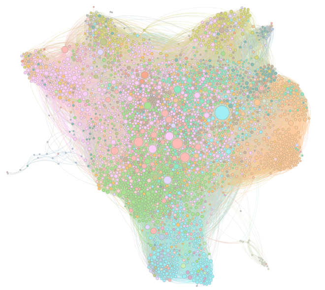
We can see that there is very strong alignment between clustering pattern and topic classification for several of the most important topics. The pink and green topic clusters on the left are related to quantum an quantum electrodynamic theory. While they have fairly distinct topic groupings, we can see that there are a fair number of papers from each category that cite or are cited by papers from different clusters. The degree of representation of these two topics (33% of the total sample) shows that this is a major focus of academic research. At the same time, the broad distribution of nodes from these topics reveals that quantum theory supports many other sub fields in the physics literature.
The most important paper in terms of number of citations in the data set is represented by the large blue circle toward the upper right of the plot. This corresponded to Large N Field Theories, String Theory and Gravity, Aharony et al (1999). Some of the keywords associated with this paper’s topic were geometry, space, mathematical, differentiable and manifolds.
The clay-red topic in the center of the graph is an interesting one. Though this topic only represents 3.74% of the sample it has an usual number of highly-cited, centrally located papers. Some keywords associated with this topic were gauge, theory, supersymmetric, su, seiberg, yang, moduli, and theories. It’s could be that this topic is at least partially related to several key authors whose names come up a lot in the abstracts of papers that cite them, and that the work they do is also broadly relevant across the physics field.
The orange topic to the right of the plot contains keywords abelian, dual, magnetic, monopole, higgs, topological, field, and electric. Electromagnetism is probably a fair designation for this topic. Its a relatively large, homogenous grouping that doesn’t seem particularly closely related other clusters. In particular, is has almost no overlap with cosmology (the yellow clusters at top of plot).
Follow up
We’d love your thoughts on how we can improve any and all aspects of this analysis. What did you find helpful? What was confusing? Would you like to chat with us about how you can apply this to your own work? E-commerce companies, intelligence analysts at DoD, retailers, political campaigns, and many other actors have found this type of analysis to be extremely revealing. Whether it’s a prospective engagement or just you sharing your thoughts on how to improve this example we’d love to hear from you.
To start a conversation check out our website or get in touch with us at info@polhooper.com or +1 (619) 365 – 4231.
